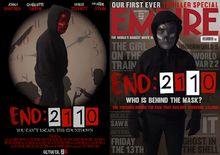
Here are the 4th drafts of my poster and magazine:
I received the following feedback about my third drafts:
Cover –
- Empire tagline is too hidden.
- White line on masked man.
- Five different shades of grey – one is weirdly outlined.
- Spacing between text and lines isn’t consistent.
- Size of lines isn’t consistent.
- 2110 – newspaper cuttings?

- white outlines around some images.
- Mask is a bit weird – sizing issue?
- Weird lump in severed head.
- The bloody knife is a bit clipart.
- Tagline font doesn’t fit.
- 2110? Cut outs?
- Weird line coming out the masked man
The Changes I Made
For the front cover, I decreased the size of the Empire tagline so that it could be seen much more clearly. I may decide to increase the size of the tagline again slightly - I will print off my front cover and see if it is a readable size when printed. I also reduced the white lines around the killer which makes the editing look a little more professional. I have also made sure that across the magazine cover, there are only 3 different shades of grey rather than 5. This makes it look a lot more professional and creates more of a style. The reason I had so many shades of grey beforehand was that due to the lighting changes of the background, darker and lighter colours couldn't be seen in certain areas. To fix this, I increased the opacity of all of the text to 100% and picked colours that could still be seen quite clearly. I also made sure that all of the text was the same and that none had any strange outlines. In my opinion, the biggest issue with my third draft was the spacing between the lines and fonts. To combat this issue, I pressed the down arrow 6 times from the bottom of the font which moved the line - I did this same procedure for all the text and lines to make sure that the gaps were the same size. To fix the length of the lines, I decided to have them all touch the edge of the front cover and then end as soon as they touch the killer. We previously changed our logo due to the newspaper cuttings blurring, however, we found a way to have the newspaper cuttings without them blurring as much by reducing their size. The newspaper cuttings fit well into the film and create something the audience can identify about the branding.
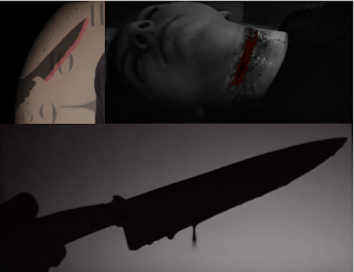
For the poster, I zoomed in and removed any of the weird, white outlines and other lines to make the editing look a lot more professional. Whilst zooming in, I also found issues with the placing of the mask so I fixed that so this will no longer be an issue. I fixed the lump in the head by moving the current black box I had and re-doing one so it didn't affect the vignette effect of the clock. In my opinion, my biggest issue was the bloody knife - looking back, it did look quite cartoony and clip-art. However, to try and reduce this, I have gone with a 'less is more' effect with the blood - I have also have decided to have the blood dripping as that is more realistic and fits in more with my trailer. I am still playing around with the colour of the blood - at the moment it could be a little bit too bright and some blood could be removed but I will get further feedback to find out whether I need to make further improvements on this. I also changed the font of the tagline - originally, I thought my previous font was quite good as it connoted horror. However, it didn't really fit in with the rest of the poster and wasn't very bold. I decided to change it to the font 'Muro' which is bolder and fits in quite well with the poster. I also changed the colour of the tagline from white to light grey which matches the colour scheme of the poster. Like with my magazine, I changed the logo so it once again included newspaper cut outs. We have also decided to make our logo even redder so this had a knock on effect on both of my ancillary products as everything needed to be changed from the original darker red to the brighter one. On my poster, I have also started to include logos at the bottom as I have found that these are common on film posters. I will continue to add logos so that the whole bottom line is filled. I also softened out some of the images so they weren't as pointy and looked a little smoother and more professional.
Here are my fourth drafts:


